Marketplace
UX/UI Design | Responsive Design | UX Research
The Public Marketplace (MP) is a open self-service platform for catering. Anyone can browse caterers, explore menus, compare options and submit requests directly online.
Discover
What was the problem?
The Public Marketplace was underperforming: it generated only a small share of opportunities and had low conversion rates. Customers often struggled with poor inventory quality (missing dietary tags, low-quality or AI-generated images), confusing navigation and a frustrating request flow that made it hard to explore options or complete bookings. This lack of trust and usability caused drop-offs and left potential customers disengaged.
Research
We ran a Lyssna study with 50 participants to test flows and answered a catalogue of questions about their online catering search and booking behavior. This revealed friction in navigation, filtering and trust and confirmed which features mattered most in decision-making.
Research Questions
-
68% preferred category-based navigation (e.g., cuisine type, dietary)
22% searched by specific dish
10% relied on search bar only
Clear category navigation was essential.
-
71%: Dietary tags (vegan, gluten-free, etc.)
64%: High-quality photos
52%: Delivery details (fees, timing)
Users decide based on trust signals first, not just price.
-
55%: Poor or missing images
43%: Confusing request flow
38%: Lack of transparency in pricing
Image quality and checkout clarity were the biggest gaps.
-
61%: want side-by-side comparisons
25%: open multiple tabs
14%: rely on reviews only
A built-in comparison feature would reduce friction.
-
74% said reviews are “very important”
19% “somewhat important”
7% “not important”
Reviews are a must-have to build credibility.
-
63%: unlikely to try again
27%: maybe
10%: yes
First impressions were critical for adoption.
Competitor Insights
I analyzed two different catering marketplaces and identified key pain points in usability, trust and operations. These findings highlighted clear opportunities to improve navigation, transparency and overall user experience in our own Marketplace.
Competitor A
Offered a very broad catalogue of caterers, users felt overwhelmed
Lack of effective filters made narrowing down choices difficult
Missing allergen and dietary labels reduced trust
Checkout required multiple steps before showing a final price, led to drop-offs
Competitor B
Positioned as a premium marketplace but lacked consistency in reviews
Pricing was not always transparent
Visuals were low quality and didn’t build confidence
Many vendor processes were manual, slowed down response times and frustrated customers
Define
Goal
The Public Marketplace project focuses on improving the way customers discover and book catering directly online. The aim is to create a smoother, more transparent experience that boosts conversion rates and positions the Public Marketplace as a trusted entry point for new business.
KPIs
Increase Public Marketplace share of total opportunities
Improve conversion rate from visitors → requests → closed deals
Reduce drop-offs on search and menu pages
Improve satisfaction with marketplace browsing and booking
Average order size via Public Marketplace
Out of scope
Full equipment rental or add-on services
Deep personalization (AI recommendations)
Loyalty or rewards programs
Native mobile app (desktop-first focus)
Persona Development
From my research, I noticed patterns among people browsing catering marketplaces. They valued the ability to compare providers quickly but were often held back by overwhelming choice, missing dietary labels and confusing pricing. I also found that customers looking for catering on short notice needed a frictionless request flow to avoid frustration.
So I created the persona, David Müller.
User Persona: David Müller
Age: 35
Occupation: Office Manager at a consulting firm
Work Style: Full-time in the office
Location: Hamburg
Goals:
Quickly find and compare reliable caterers
Ensure dietary needs (vegan, gluten-free) are covered
Stick to a budget without hidden costs
Frustrations:
Overwhelming number of options without clear filters
Poor-quality photos and missing menu information
Complicated checkout flows
Behaviors:
Uses marketplaces to compare several providers before booking
Relies on reviews, logos, and trust signals to make decisions
Prefers clear pricing upfront and minimal steps to request

Develop
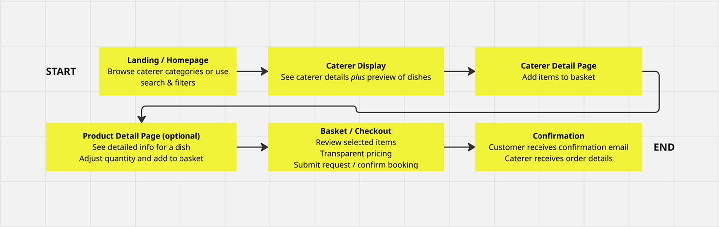
User Flow
First Wireframes
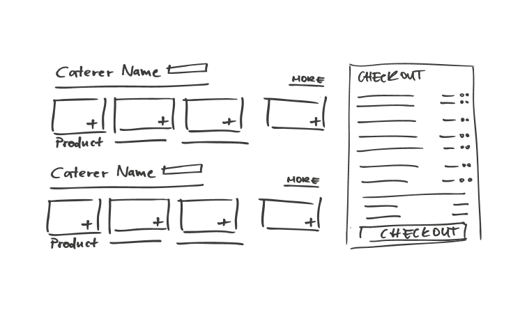
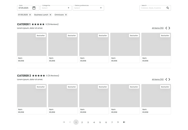

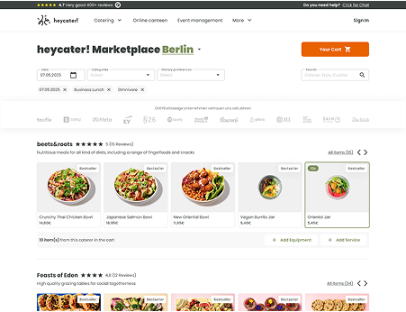


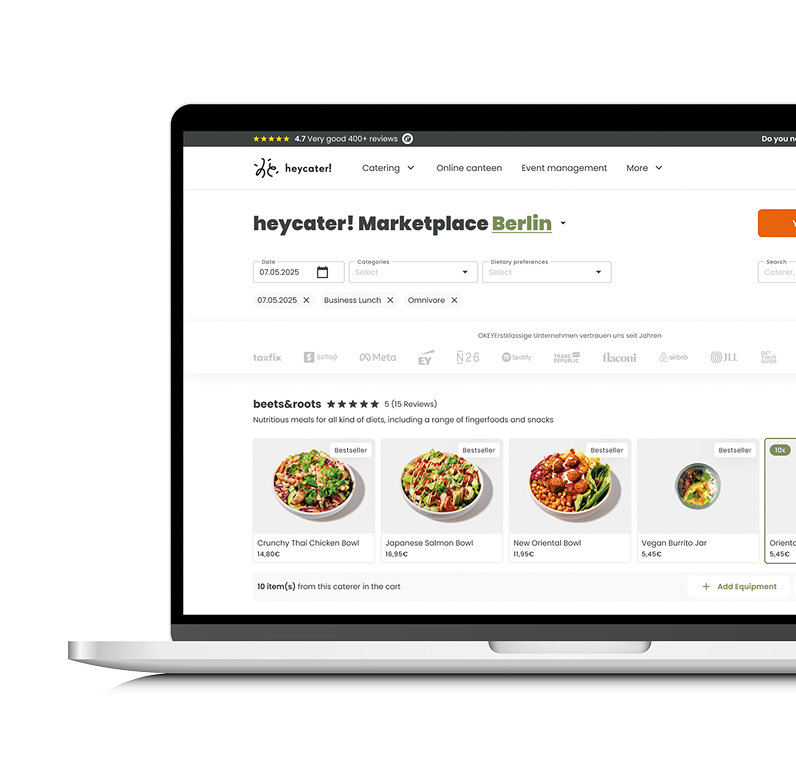
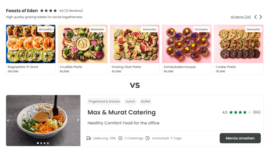
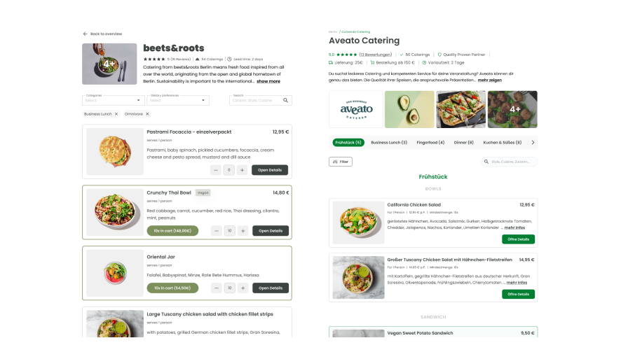
Caterer display: biggest change of the project → redesigned cards to show caterer details and a preview of dishes, giving users a quick glimpse of the offer and boosting conversions by removing one extra click before adding to basket.
Filtering: tested multiple options → introduced filters for date, dietary needs and cuisine types.
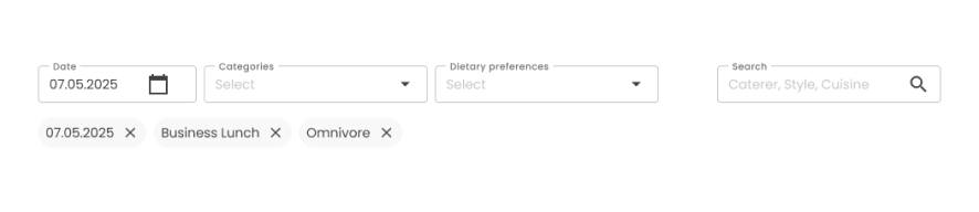
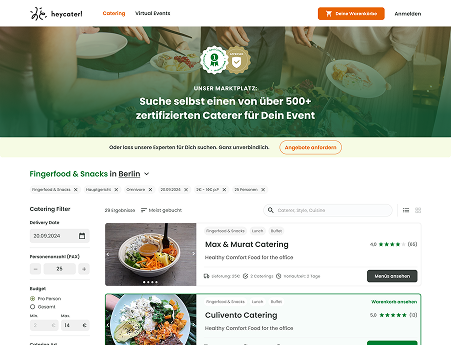
Navigation: explored different structures → simplified browsing with clearer categories so users can quickly find caterers by cuisine, dietary needs, or price range without feeling overwhelmed.
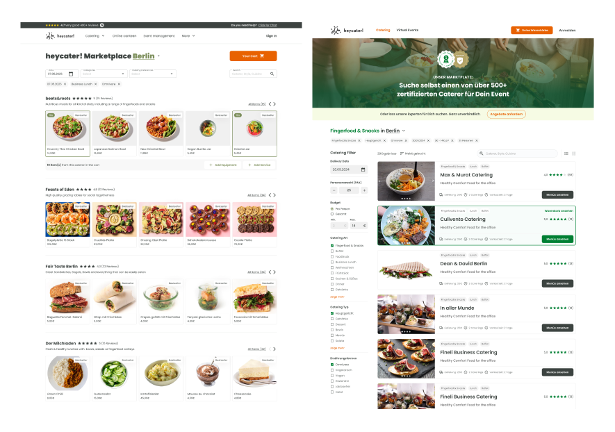
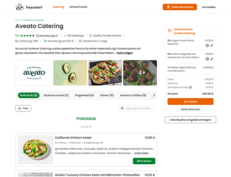
Dish info: missing tags frustrated users → added clear vegan, vegetarian and gluten-free labels.
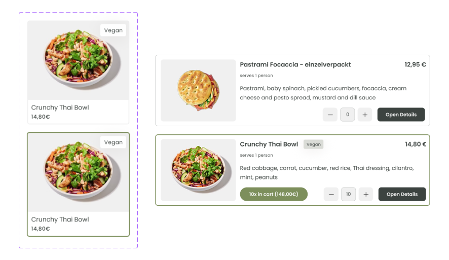
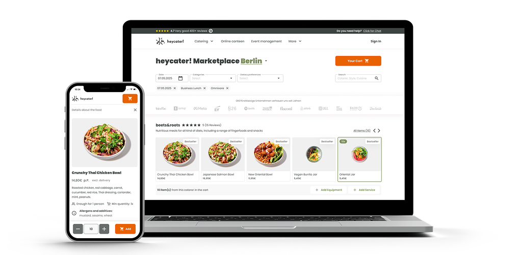
Caterer detail page: simplified the layout → removed unnecessary info (status, delivery fee, minimum order) and cut the picture carousel to keep focus on dishes. Added an amount counter directly into dish cards to make quantities transparent and reduce extra clicks.
Product detail page: kept the proven layout → only moved the item counter into the CTA section to make the connection clearer. Since the page already performed strongly, we avoided bigger changes.

Deliver
What was the result and impact?
Clearer navigation and simplified search
Improved menu and caterer presentation with better images and labels
Transparent pricing and dietary filters (vegan, gluten-free, etc.)
Streamlined request flow from browsing to checkout
Updated transactional emails to support the self-service journey
Reduced user frustration with missing info and poor images
Visitors able to explore options faster and submit requests with fewer steps
Higher trust thanks to improved transparency and labeling
Streamlined request flow from browsing to checkout
Early signs of increased conversion from visitors to opportunities
We found that improving image quality and labels, combined with a simpler navigation and request flow, not only built more trust with users but also reduced friction and directly contributed to higher conversions.